
The spaces between items communicate messages.
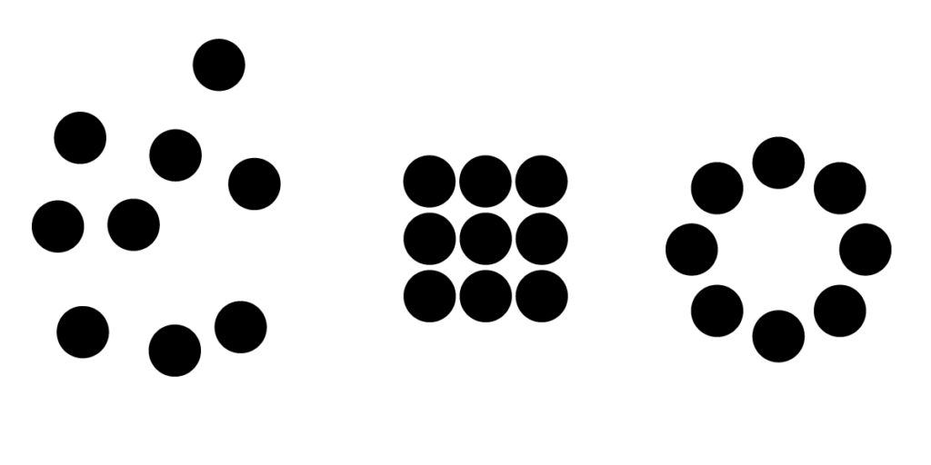
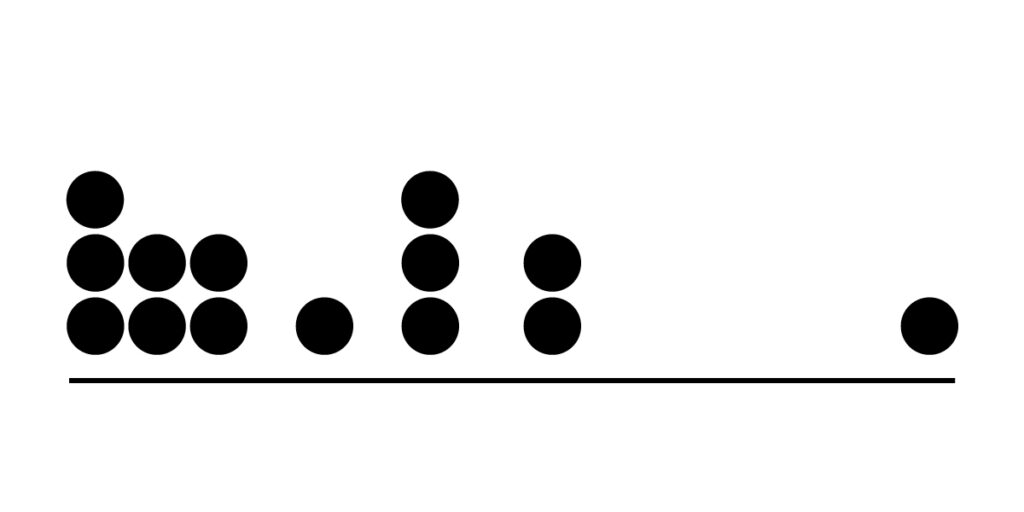
The circles to the left feel sporadic and unrelated. It’s hard to tell which ones are being grouped or even if there is a group structure. The proximity of the items to one another does not communicate; there’s a clear purpose for their arrangement. Both the center and right examples feel like cohesive, planned groups. Notice how the space between each circle is the same. This arrangement creates a gestalt where the viewer automatically groups the circles together because they share the same space between them. It doesn’t take much space between elements to create groupings.

Groups are created just by adding a tiny bit of extra space between the dots above. When grouping elements, it doesn’t take much change in proximity to get the job done.
Layouts and Proximity
The relationship between elements in a design layout should look and feel planned. No items should feel like they are “floating” or arbitrarily stuck on the page or screen. Everything relates and has a place in the Web Design Grid example below.
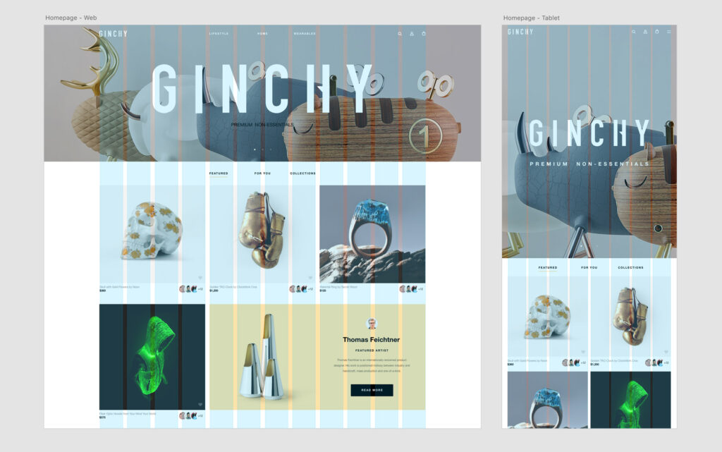
Pay careful attention to every element in a design. Notice how the image above aligns the logo in the top left part of the page with the grid boxes in the body of the page. Every element aligns in some way. Let’s hear more about Proximity in Graphic Design.
While the people who view design will never see the grids designers create, the alignments they make possible make for easier reading and harmonious, professional-looking design that’s easier to use.
Diagrams: Distance Communicates
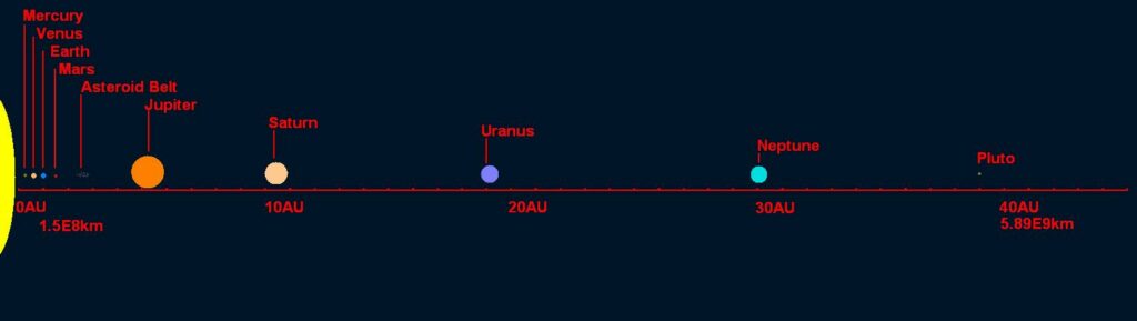
Designing the space between elements in a diagram is another way to communicate content. Here, the message being communicated is the actual measure of space between items. For example, the diagram below shows the distance between planets in the solar system.
The example above is simple but gets the job done. Distances are labeled so viewers can refer to actual distances. The example below skips the labels and relies on representative imagery to show distances in the solar system.
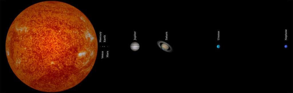
Both diagrams show the distance between planets, but with a different emphasis. The top example is about specific values, and the bottom example is about realistic representation. Neither is wrong. When choosing what to show in a diagram, consider what about proximity is important for your message.
Even in a diagram where there is no content, viewers can get a hint that proximity is communicating something.
The arrangement of circles above implies that the circle to the right is an outlier. We have no idea what these circles mean, but the space between the circle by itself and the other circles indicates that the lone circle represents something that is different from the other instances.