Some concepts are so complex that designers need to show the full system for them to make sense. Diagrams allow us to visually explain many parts of a system and the ways they are interconnected. Sometimes, the connections themselves are the most revealing parts of the diagram.
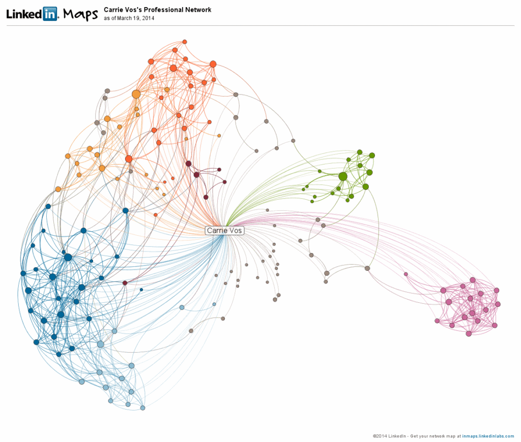
For example, visualizations of social networks are composed of nodes (like dots or icons of people) and connectors (lines that go between people or groups, called collectives). In these diagrams, the connector lines are the power of the diagram. They show how relationships between people keep them together and sometimes isolate certain people in the network. Any node that has more lines coming off of it is more connected. Nodes with few connections are isolated. There are many types of diagrams. Some of the main types include the following.
- Tree Diagram
- Network Diagram
- Flowchart
- Venn Diagram
- Existential Graph
- Histogram
- Bar Graph
- Pie Chart
- Function Graph
- Scatter Plot
Visit 44 Types of Graphs hosted by Visme to see visualizations grouped by industry. Diagrams can be created using visualization software or they can be hand-crafted in software like Adobe Illustrator. Either way, selecting the right diagram for the information is the most important step when creating a diagram.
Diagrams in the Wild
Let’s look at some more diagram examples to learn how they work.
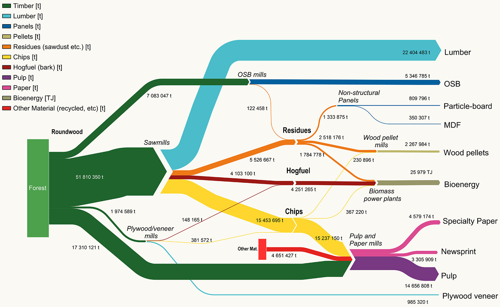
The Tracing Wood Fibre in Canadian Forestry Sankey Diagram below visualizes the downstream flow of Canadian forests into the products that are made from them. Green is a natural choice for denoting forests. As we read the diagram from left to right, different colors emerge to delineate different products that come from forests. Size is also used to show the quantity of each forest-produced product. Look at the right of the diagram. It’s clear that the quantity of Lumber produced (in light blue) is greater than MDF.
Network diagrams show connections between nodes. This social network diagram reveals the people that are very connected and those who are on the periphery.
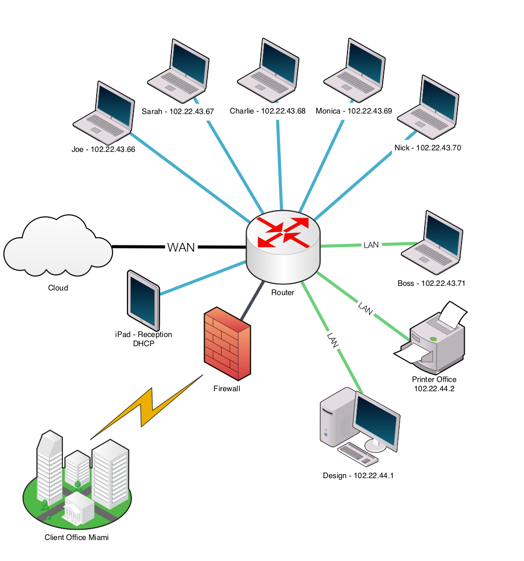
Often, icons can make diagrams a lot easier to understand. This Network Diagram shows how computing equipment is connected inside an office and also how they relate to the world outside the local network. Each element in this diagram is easy to identify because they are shown as icons and each one has a label. Notice, even the connections between elements are labeled to clarify system relationships.
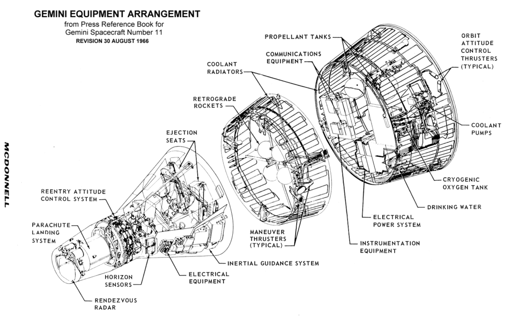
Schematics are also diagrams. These are very specific visualizations of parts that often guide troubleshooting and training work. The real strength of a schematic is its ability to show all of the parts in relation to one another.
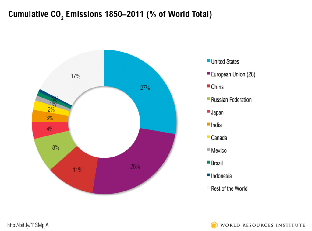
Pie charts and bar graphs are basic but helpful diagrams. This example is not the most imaginative pie chart in the world but it does communicate the information quickly.
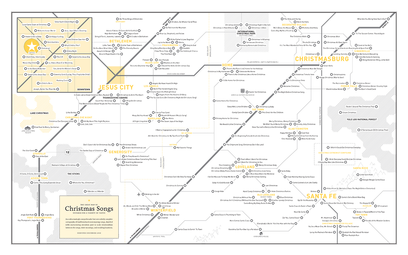
Abstract concepts like the relationships between Christmas songs can even be diagrammed. A large sample of Christmas and Holiday songs are shown as a map just for fun. Download a PDF version of The Great Map of Christmas Songs.
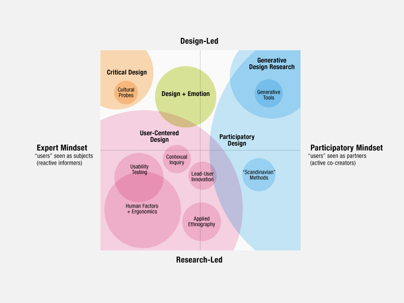
Design Researcher Liz Sanders visualized design practice and research in 2008 using a chart-based Venn diagram approach.
Dubberly Design Office visualized the creative process—a complex diagram that shows parts, their relationships, and descriptions all in the same poster.
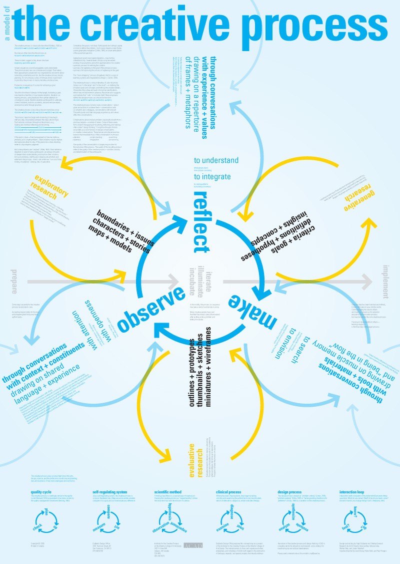
Diagram Parts: The Essentials
Diagrams can vary widely in style and application, but they are often composed of at least a few of the parts listed below.
- Title: The diagram’s subject.
- Labels: Each element in the diagram should be labeled or at least a key should be included.
- Elements: The items in the diagram. These differ widely depending on the type. Elements can be icons or they can be simple shapes.
- Proximity: The measure of the space between elements adds meaning. Venn diagrams use overlaps to show the amount of commonality.
- Connections: Lines that connect elements. These are most commonly found in network and flowchart diagrams.
- Size: Larger items denote “more” and smaller elements denote “less”.
- Color/Value: Color or value/shading can denote less or more, or can group items for easier reference.
When you create a diagram, use each of the parts above as a checklist. Are you missing an opportunity to show quantities by making some items larger and others smaller? Is your content more about connections than it is about the elements, themselves? In this case, it would be best to simplify icons and focus on the lines and proximity between them. As you produce more diagrams, you will become more adept at choosing what parts to emphasize and what parts are not helpful for communicating the message.