
It’s not too uncommon for designers to evaluate screen-based media like websites. Typically, this type of research is conducted to guide how to design this type of media—how to create designs that will fit into a market or what content to avoid so designs will be memorable and will stand out.
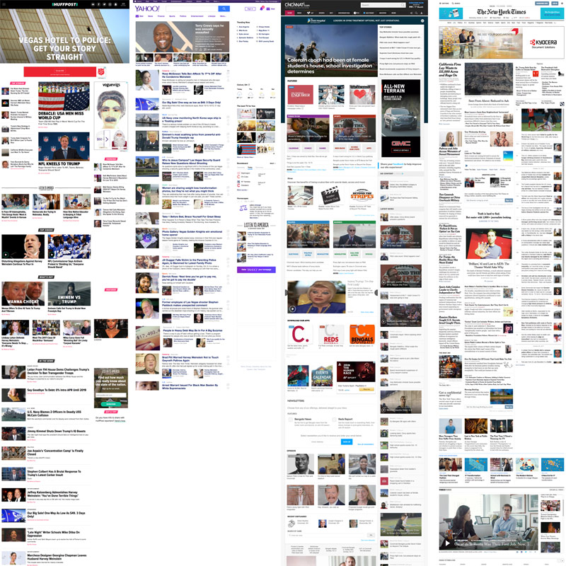
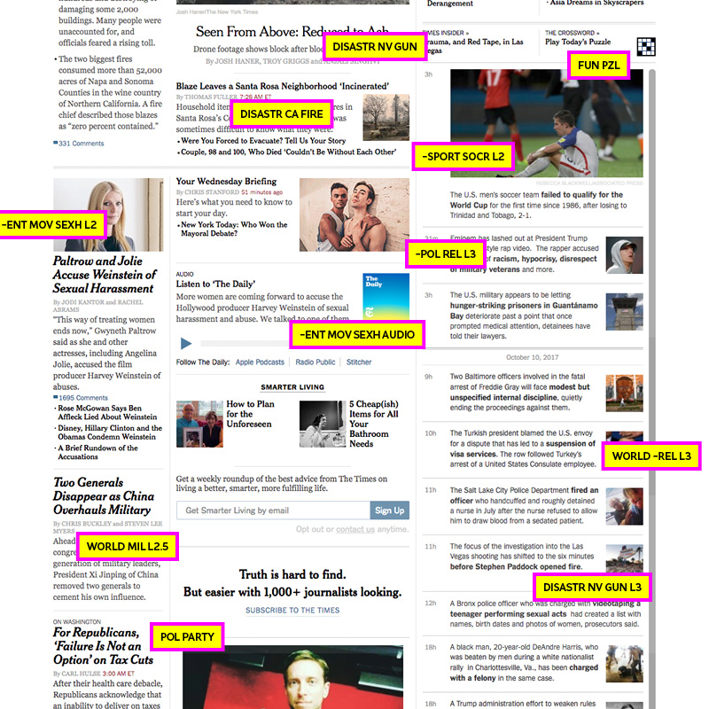
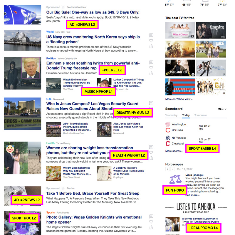
Just a cursory glance of The Huffington Post, Yahoo, Cincinnati Inquirer, and The New York Times websites reveals how their design balances advertising, content hierarchy, and promotional content.
We could analyze each site layout to determine patterns that would inform design (this would be visual research). For example, a review of content hierarchy could reveal that local stories typically show up only in the smallest areas of these pages while national stories (typically sponsored by some sort of advertiser) typically get the most screen real estate. If we were trying to design a site that would have a uniquely local focus, flipping that model by giving local stories the most exposure on the site and reducing ads to smaller sections could say a lot about our new hyper-local new website.
Coding and Analysis for Content Discovery
While a macro view of these sites is helpful for designing websites, a content analysis tells us a lot more about the people who are reporting the news and the content being reported, itself. Notice in the codes below, the size of a news story is addressed. A code like this can be helpful for analyzing the expressed importance of a story (if we assume bigger is “more important” to the people who designed the site.
Note: not all of the content is coded below. These are just rough examples. If this were a real research project, each item on each page would receive some sort of code/analysis.
Huffington Post
- – : Negative story/content
- + : Positive story/content
- POL: Politics
- REL: Relationships
- L1: level 1 size – biggest headline/content
- L2: level 2 size – medium headline/content
- L3: level 3 size – small headline/content
- SPORT: Sport content
- WAR: War content
- $ : money content
- SOCR: Soccer content
- NFL: National Football League content
- ENT: Entertainment content
- MOV: Movie content
- SEXH: Sexual harassment content
- REAL: Reality-based content/”real life” local stories and local people
- FAM: Content about families
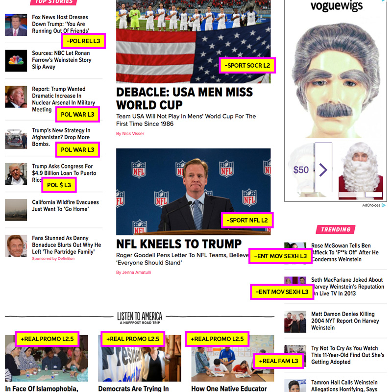
The New York Times
- DISASTR: Content about a disaster
- CA: California
- NV: Nevada
- GUN: Content about guns
- FIRE: Content about fires
- FUN: An interactive game or content that is purely for fun and entertainment
- PZL: Content about a puzzle
- AUDIO: Content about audio
- WORLD: World news
- MIL: Military content
- PARTY: Political party content
Yahoo
- AD: Advertisement
- =2NEWS: Content being presented as news/equal to other news stories
- MUSIC: Music content
- HPHOP: Hip-hop content
- HEALTH: Health content
- WEIGHT: Weight content
- L4: level 4 size – smallest headline/content
- HORO: Horoscope content
- PROMO: Promotional content
- HOC: Hockey content
- BASEB: Baseball content
That’s a lot of content and a lot of data points. Imagine doing this process for 25 different newspaper website front pages… that would be a ton of work! It also would produce some fascinating insights into what one day of news looks like: what stories appeared the most in what types of websites, how many times ads were presented equally to news, or how often sports stories were shown at a “level 1” to suggest sports would be perceived as very important.
Of course, this all assumes we’ve cleared our web browser history and cookies. When doing an analysis of websites, don’t forget that your browsing history often impacts what you see!