Size

Size is a powerful tool in your visual communication toolbelt. Showing something large next to something very small can send a message of domination, variation, or diversity—it all depends on how you present it. Joseph Müller-Brockmann’s poster below uses size to communicate that speed is dangerous. The child in the background is small and running away while the motorcycle is huge in the foreground.

While the image is spatially correct (things closer to us are larger and smaller further away), the size of the motorcycle makes the child feel helpless, which reinforces the message.
Communicating via Size Relationships
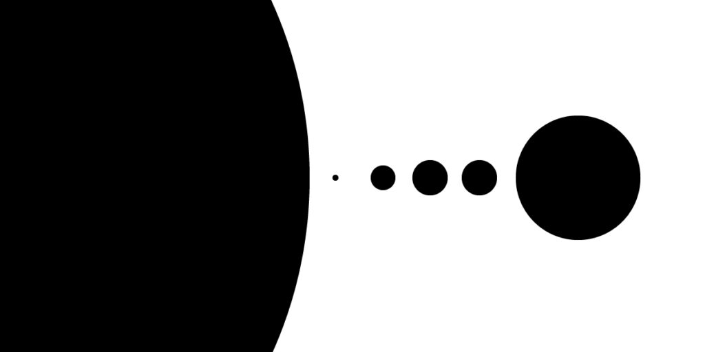
Size can also communicate messages without needing representative imagery. For example, the circles below show mass relationships even without needing written labels to tell us what they are quantifying.

The circles image above is a rough representation of Solar System planet size relationships. I made this up on the fly as an example so the planets are not to scale. Still, the viewer can tell with just a quick glance that the sun is pretty huge and that planets vary significantly in size.
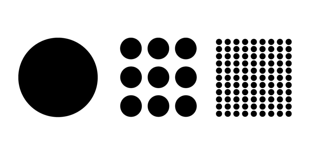
The size of items can also communicate equivalents. In the example below, it seems that the three circle groupings (1, 9, and 81) are all equivalent. One big circle equals nine medium circles which also equals 81 tiny circles.

Size is a powerful tool for communicating quantities in data visualization. Showing relationships allow readers to better understand concepts and messages where differences or similarities are the message.