Everything has a place. One of the first questions you have to answer when designing visual outcomes is…
“Where should everything go?”
Staring with a blank canvas (or sketchbook or InDesign file…) can be a daunting challenge. While you may know the page dimensions or screen size for your design, all the space inside it is wide open. Before you design the “thing”, design the grid.
Grids are the invisible scaffolding that holds your design together. They help you decide where to place images, headlines, and body copy (text). One of the fun things about grids is that people who use design often do not know they exist. When people use good design, they just know it works. Grids make things work behind the scenes so people don’t even notice why it works. Let’s see some grid layouts in action.
When designing a grid, pay attention to these basic components:
- Margin: The space around the page
- Columns: Vertical columns in the body of the page
- Column Width: Don’t make columns too wide. Between 52 and 79 Characters is ideal to make reading easier
- Gutter: The space between the columns (so words don’t run into each other)
Once you’re ready for some advanced grid work, implement these into your process:
- Baseline Grid: A horizontal grid that equals the leading size of the text on your page
- Flowlines: Horizontal guides that indicate where repeating headlines or large images always appear across all pages of a document or a website
Grid Systems are important for web and screen-based design as much as they are for print-based work. Jesse Showalter gives an insightfully clear grid walkthrough in the video below.
Grids In Action
One of the best ways to learn why grids are important and how they work is to study them. Let’s browse some grids, shall we?

How many columns are in the grid for the poster above? It looks like the designer only used two columns and spanned these columns with the headline at the top and the logos at the bottom. Notice how the design uses lines (called “rules”) to separate content. Rules can be a very effective and simple way to organize content but still maintain an openness in the design.
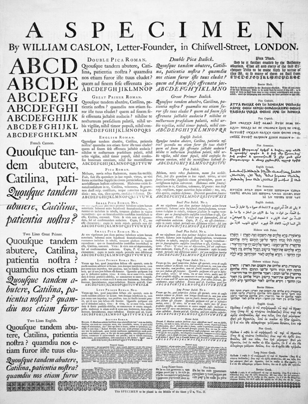
This type specimen for the typeface Caslon is set in four very clear columns. ‘Hard to miss these columns because they are so filled with text.
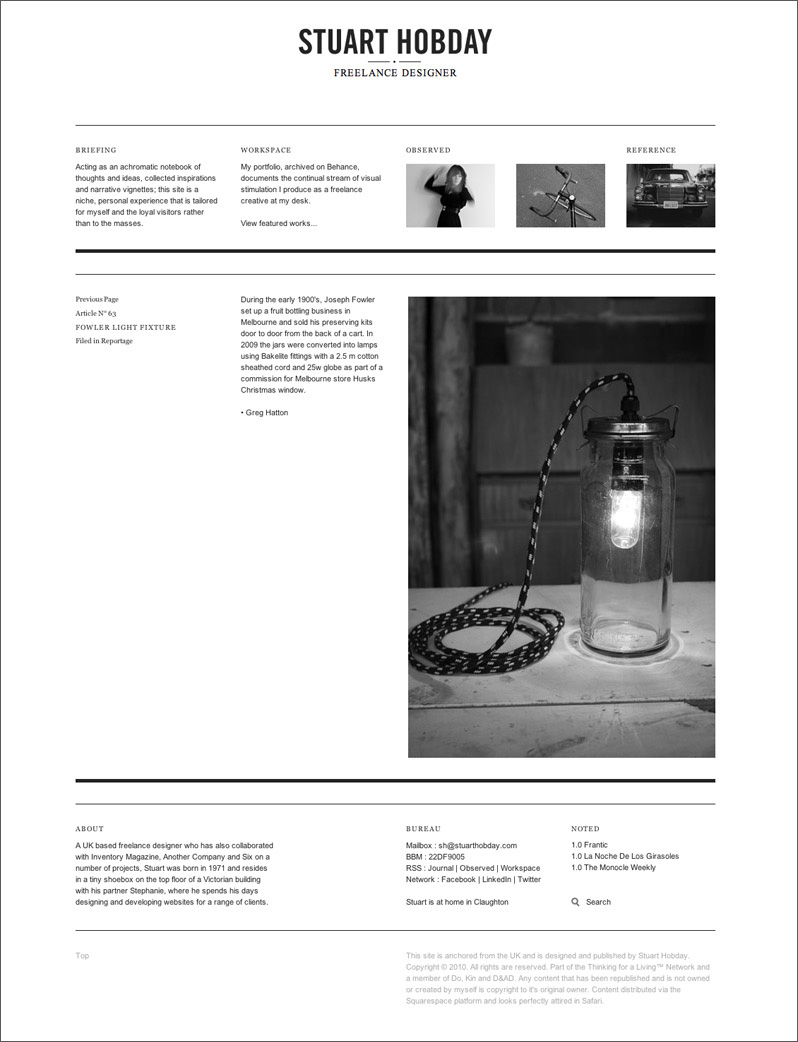
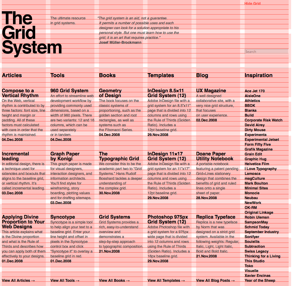
When you use a grid, you don’t have to fill every column. The resume above is a good example of this. In some places, the designer decided to not use every column—opting to span columns with content and leave others completely empty for a very open, modern design with lots of white space.
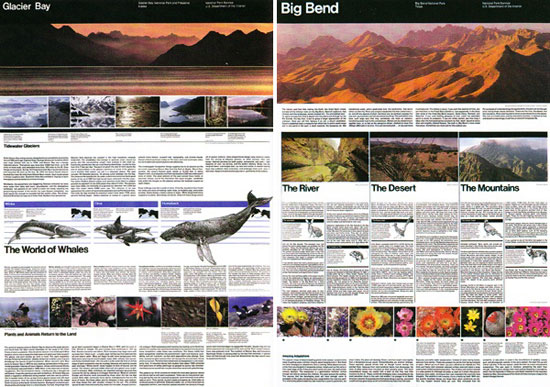
If you have ever been to a National Park in the United States, you have likely seen one of their iconic park guides. These guides use the Unigrid system, developed by Massimo Vignelli in 1977. The grid features a ton of columns so designers can span columns and fill others but still maintain an orderly and consistent design from park to park.
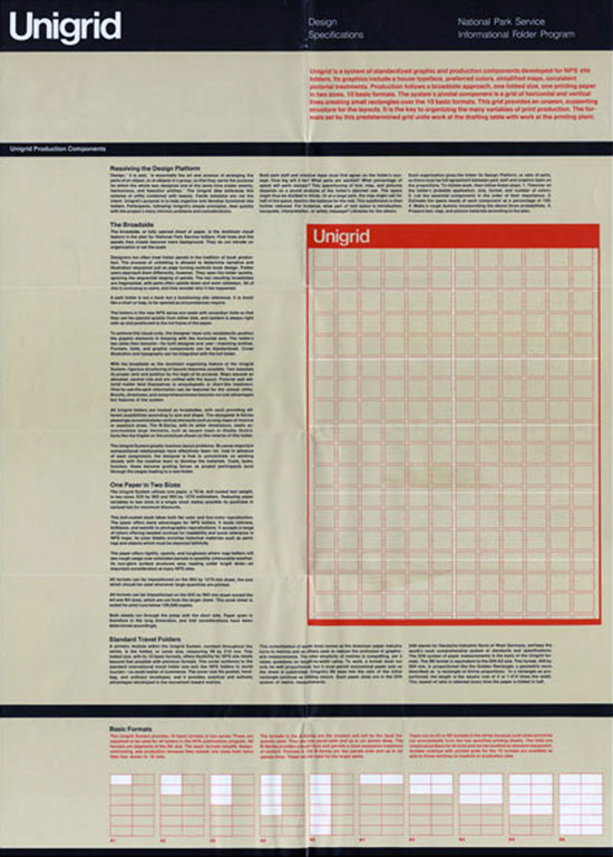
The poster above details Unigrid’s super-grid structure. Not only does Unigrid feature columns, but it integrates flowlines—vertical alignments that help keep content organized.
Next time you start a design project, design the grid first. Your work will look consistent from page to page and readers will not even notice. Grids FTW.