
Concepts are a currency designers use to communicate ideas. While we could just tell people “hey! drink more water!” …the message isn’t all that intriguing and in fact it feels a bit bossy. People yelling hydration imperatives at people are likely to get the response of “step off!” But when we frame messages in conceptual ways that express the content in a new or engaging way, messages are fresh and often inventive. People like fresh and inventive.
Let’s dissect a few great concepts to learn how they work.
Nixon Clearly
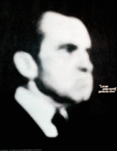
President Richard Nixon famously stated in one of his speeches “Let me make myself perfectly clear. I am not a crook.” Nixon was eventually impeached for his role in the Watergate scandal. This poster highlights the absurdity of Nixon’s statement by blurring his face. The poster is bold—only in black and white, featuring only one image. The concept is powerful. Nixon said he was clear but his image is not. It’s an image of a man whom the designer did not think could be trusted.
Coffee Time

Take a closer look at the banner image for this page. It’s a coffee mug, right? Notice how the sugar cubes are arranged and where the spoon and mug handle are positioned. It looks like a clock, right? So, what’s the concept here? When I “read” this image, it says “coffee time.” The best concepts share a message in a way that viewers “get it” even though the design never literally “tells” them the message.