Information doesn’t always translate correctly into words. When we read, our brains have to munch on the text and then construct concepts. This munching takes a lot of brainpower (aka, cognitive load) and it’s not very efficient or fast. Sometimes, images can do a far better job of communicating concepts that are not concrete. When we look at pictures, our brains don’t have to do all that translating and they can also take all of the visual information simultaneously. “Seeing the whole information picture” can shed new light on information.
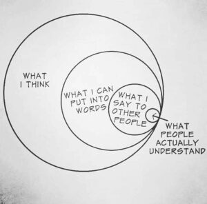
Visualization doesn’t have to be fancy to be effective. It’s amazing what a few circles can do to make thinking make sense.
Circles aren’t the only ones who can communicate meaning. Let’s give lines a chance.
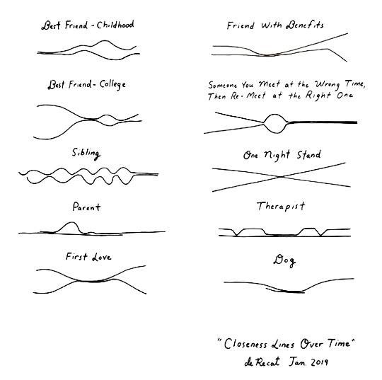
Go back and read those lines in Closeness Lines Over Time by Olivia de Recat. First love. Therapist. Dog. The lines our lives take are altered by our relationships. Well-placed lines visualize those relationships so well.
A Few Visualization Examples in the Wild
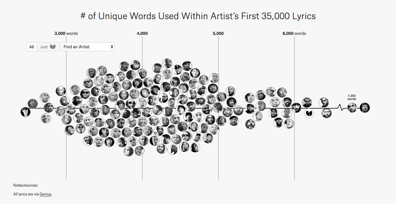
“The Largest Vocabulary In Hip Hop” visualization below makes a variety of word choices a lot easier to comprehend. At just a glance, we can tell that the main cluster hangs around 4,000 unique words. Just a few artists use more than 6,000 words and a few use under 3,000 unique words.

We could have spent time reading about this phenomenon, but viewing it made it so much easier to understand. This example uses proximity to help readers understand word usage in Hip Hop.
The Tampa Bay Times produced a visualization in 2015 to bring inequality more understandable.
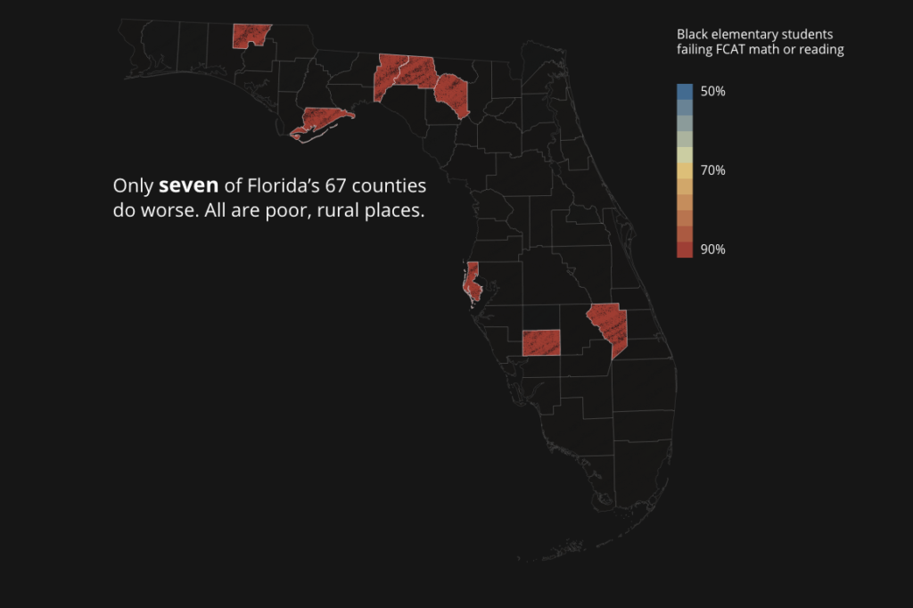
Notice how the visualization uses color to indicate severity. Anything that’s warm in color is severe and anything that’s cool is nominal. At one glance, readers can identify problem areas.
Not all visualizations are static. Google’s visualization of Thanksgiving 2015 air travel tells the story of holiday migration.
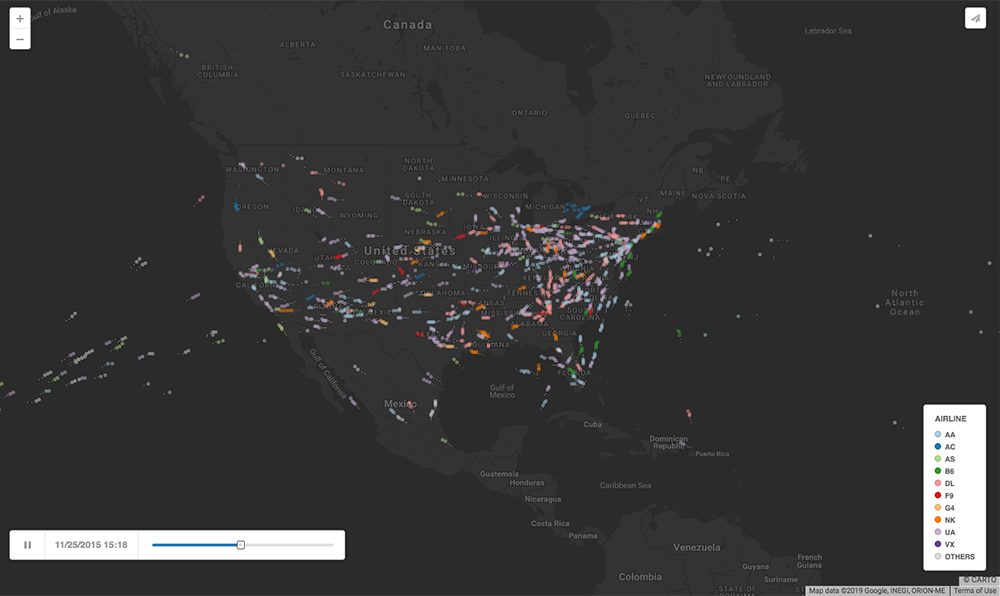
The Proximity of flight departures and arrivals helps reveal major travel centers for Thanksgiving. Color identifies airlines. The map of the United States is pretty familiar, so geography gives context.
Enable Understanding
Designers visualize information to make it easier to understand. Sometimes visualization simply makes data tangible and reports what actually happened, like showing how many times pitchers threw inside pitches to Jose Altuve in 2017. However, the most impactful visualizations reveal unseen and unnoticed phenomena that would otherwise be ignored if they were not made tangible.
The Fallen of World War II video below uses motion to communicate casualties of World War II. Notice how it helps the viewer better understand how severe the loss of life was in World War II by visually contextualizing these losses.
We are visual and spatial thinkers who are comfortable adapting to a changing world. At their best, designers see time and space as interrelated concepts. When designers apply this unique skill to visualization, they take what is difficult to comprehend because of its immensity and make it tangible so others can understand and act upon the discovery.
Data Visualization Basics
We are hit by so much data every day that it can be hard to keep up. Gertrude Stein even noticed this in 1946…
Everybody gets so much information all day long that they lose their common sense.
Gertrude Stein, “Reflection on the Atomic Bomb” (1946)
When we visualize data, we have some tools in our toolbox such as color, shape, size, proximity, hierarchy, emphasis, and abstraction. William Beutler and Jenny Karn from Beutler Ink talk about the Basics of Visual Grammar and give examples in their presentation at Harvard from 2015.
Data Visualization Basics, Applied
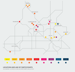
The diagram above visualizes research participants from a study on men’s views of mental health counseling in the Dallas/Fort Worth area in Texas. Notice how color is used to show participants’ ages. Color allows readers to discern where people live and their ages at a glance. Based on this visualization, it’s clear that most participants lived to the north and west of the D/FW Metroplex. One outlier lived southwest of the area.
Visualizations like this one can help readers better understand the content of a study. It can also reveal gaps for researchers. For example, with so few participants in this pilot study, it would be a bad idea for researchers to weigh the southwest participant’s responses heavily if they were markedly different from everyone else’s. If this individual’s views were different, researchers would have to get more responses from participants in the southwest to ensure this one person’s opinions reflected that community’s thoughts.
Download a compilation of visualizations from Where’s the Design in Design Research? for more applied visualization examples like the one above.
Visual Storytelling
When creating a visualization, don’t forget that you are a storyteller. Show relationships, connections, and processes in your data visualizations so readers can better understand the information you are trying to communicate.