Welcome to your new addiction.
It’s hard to think of any kind of communication design outcome that does not involve typography. Letterforms convey meaning through the words and phrases they compose. The style of the letterforms goes even further. Designers add another layer of meaning to the content through the typeface they select.
Before we dig into how typography can express, let’s get to know some of the fundamentals.
Typography in Action
Now that we know a few concepts like hierarchy, sans serif, and layout, let’s look at a few examples to get to know typography in its native environment.
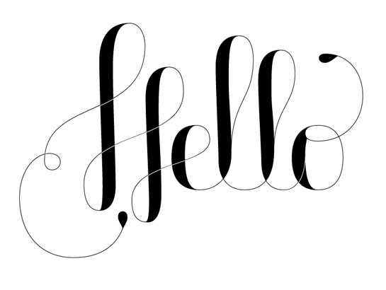
The designer communicates a friendly, elegant “hello” by using a script typeface. Notice, while this is a script, it’s not a super-fancy wedding invitation script. Rather, this script is unpretentious and modern due to its super thin and thick lines that align vertically instead of looking like they were handwritten on a slant.
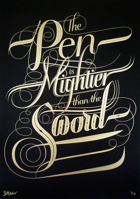
Here’s another script example, but this one is pretty aggressive and strong. Those super-pointy ends and long swashes that feel like they race across the page convey movement and energy. It’s as if the type was rendered to look like the tips of many swords. Hmmm…
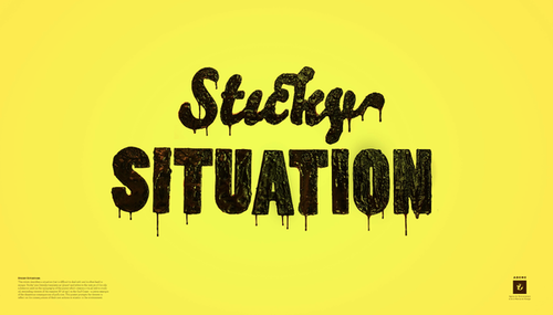
This typeface oozes meaning. The runny type helps the reader feel the sticky situation. If this were rendered in Times New Roman, we wouldn’t need to wash our hands after reading it because it’s so gross.
Everyday Typography
Poster examples and one-off type samples like the ones above are fine examples of how type can convey messages. However, most typography is more practical—aimed at conveying meaning while being useful for longer reading and more complex messages.
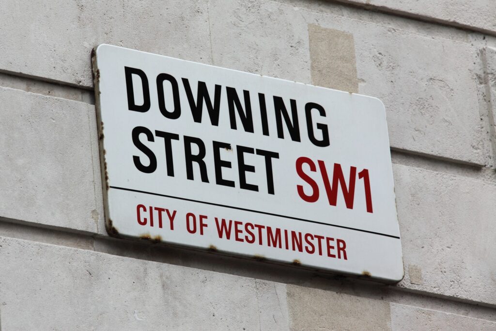
This street sign in London uses a condensed sans serif typeface to get the job done. There’s nothing fancy here, just information that helps people navigate. Still… there’s a lot going on. The condensed typeface allows more content to fit on a smaller sign. Color is used to indicate what parts of the sign mean (the WC2 numbering stands out because it’s red, though it’s the same size as “Orange Street”).
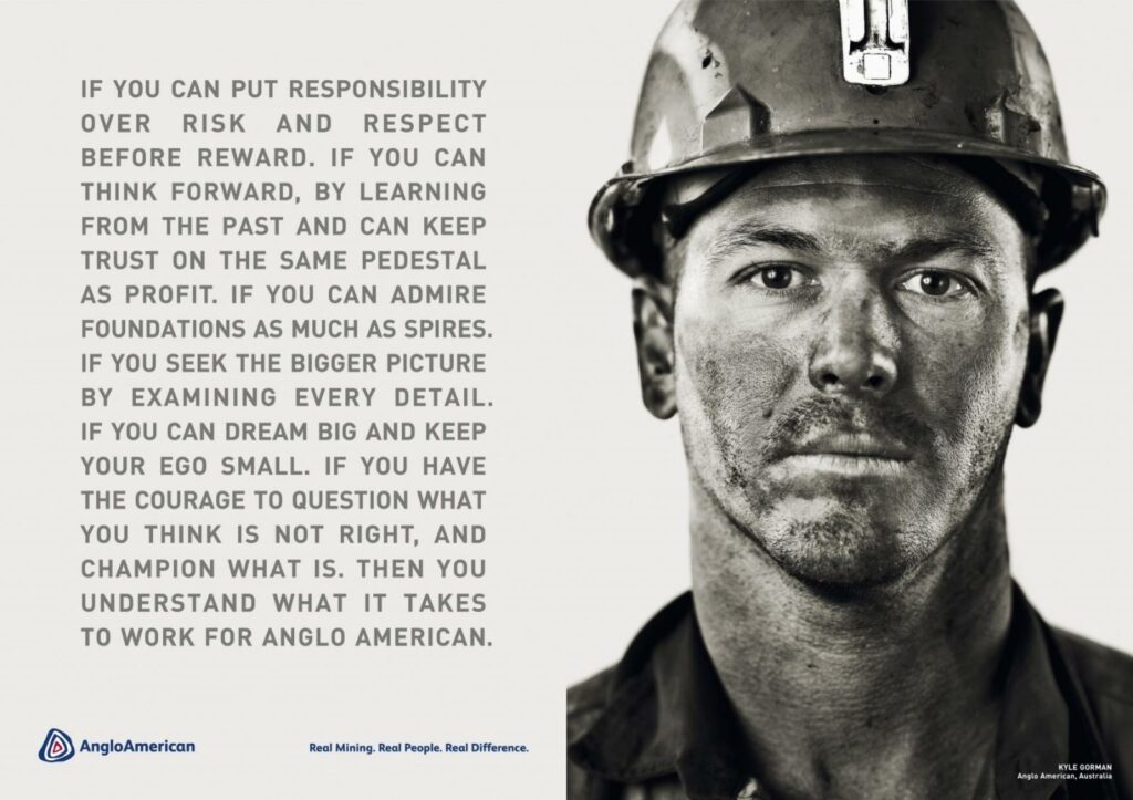
This advertisement uses all capital letters to present a bold message that reads easily. The type is set as a clear rectangle (justified type), emphasizing the man’s bold portrait. (Note, the rivers that appear in the type are unforgivable. The designer should know better than to leave that much uneven space between words.)
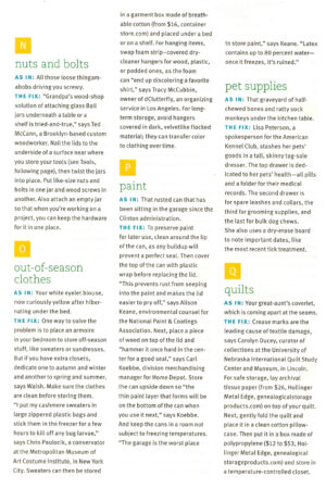
The page above seems like nothing special… but there’s a lot going on here. It’s clear that this page is intended to be read. Notice how the designer uses sans serif type for the main text, and a slab serif typeface for the subheads. The words “AS IN” and “THE FIX” are set in all caps and blue to help them stand out from the rest of the text. The designer creates three levels of hierarchy in a very subtle way in this layout. Typographic ballet!
Meet Your Type
As you use typography, you will find that a few typefaces may become your favorites. That’s a good thing. Just make sure your favorites are good typefaces. As with many products, there are knock-offs and cheap typefaces that aren’t well-made. When typography is wrongly applied, communication falls apart. Spend a little time to get to know typography.
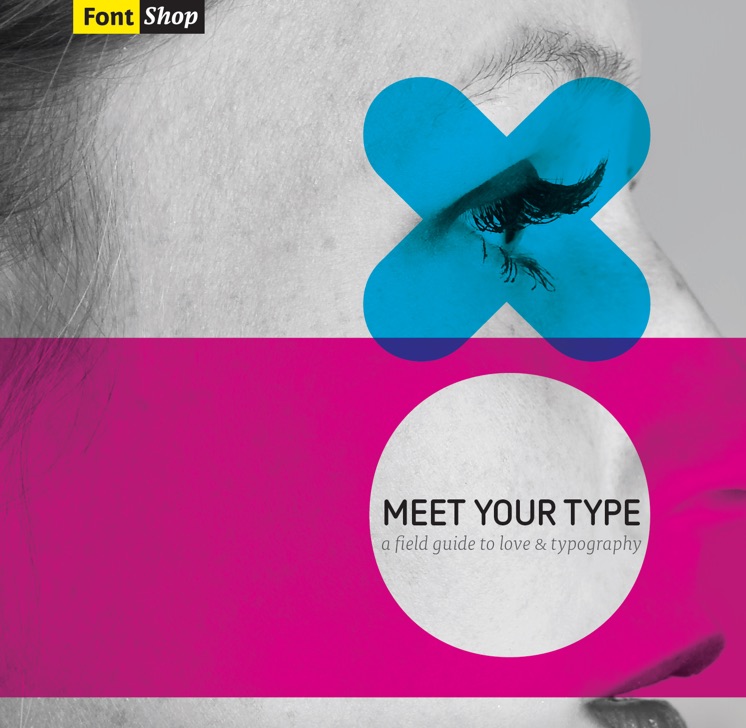
Years ago, the type foundry Font Shop produced a booklet called Meet Your Type. It’s one of our favorite resources for getting to know typographic terms and selecting the right typeface for the job. Download and read it. The booklet will have you on the edge of your serif the whole time. (see what we did there?)
Typography is Used
We’re designers and we love type. But we also know when typography needs to get the job done and get out of the way. Remember that people will use the typography you set. Pay careful attention and make sure typography is large enough to be read by people whose eyesight may not be as strong as yours. Consider if your design will be viewed in low light and factor that into your design. Make sure any type you set for screens can be translated into different languages and is compatible with reading assistance devices. The design decisions you make could block some people from accessing content. You can make the world a more usable place.