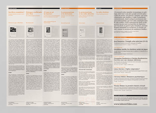
Layout and Composition

Most design work involves putting content in logical order. This is done through layout and composition. The principles that govern layout are pretty simple once you know what they are called. Let’s take a look at the basics.
When you analyze something that has been designed or are creating something yourself, run through the list of these basic principles in your mind.
- Proximity
- White space
- Alignment
- Contrast
- Repetition
When examining your work, ask questions like… “Did I arrange elements in ways so they “held together” as logical groups? (proximity). Are there any elements like text or images that are “floating off” and do not align with anything else? (alignment).
The more critical you are of your work, the more it will improve.
Hierarchy
When we design, we decide what is most important and secondary, tertiary, and other-aries. Our decisions define what headlines (h1), subheads (h2), body copy (text), and other levels of hierarchy are. Defining hierarchy brings order to the work and makes it easier to use.
Typographic Hierarchy
Typographic hierarchy is one of the most effective ways to define a hierarchy in visual design. We have many different tools in our toolbox for developing order in our layouts when using type. For example:
- Typeface selection: Some typefaces are bold and others are light. The heavier the typeface, the more attention it tends to get
- Size: Bigger type, more attention
- Weight: The thickness of the letters
- Capital and lowercase letters: All capital letters tend to feel heavier and get more attention
The article Every Design Needs Three Levels of Typographic Hierarchy on the UK design agency Freedom of Creation website discusses typographic hierarchy in detail. Give it a read to learn more.