Dunkin' uses stickers to tell customers that items are not available.

In November 2021, during the COVID-19 pandemic, stresses on the supply chain meant businesses often did not have the ingredients they needed to provide their services and products. It was common to go to a restaurant only to find they were not serving your favorites.
Some organizations handled these shortages poorly. Customers left feeling like the business told them: “deal with it.”
But Dunkin’ Donuts handled some of these shortages with grace, staying on-brand even through adversity.
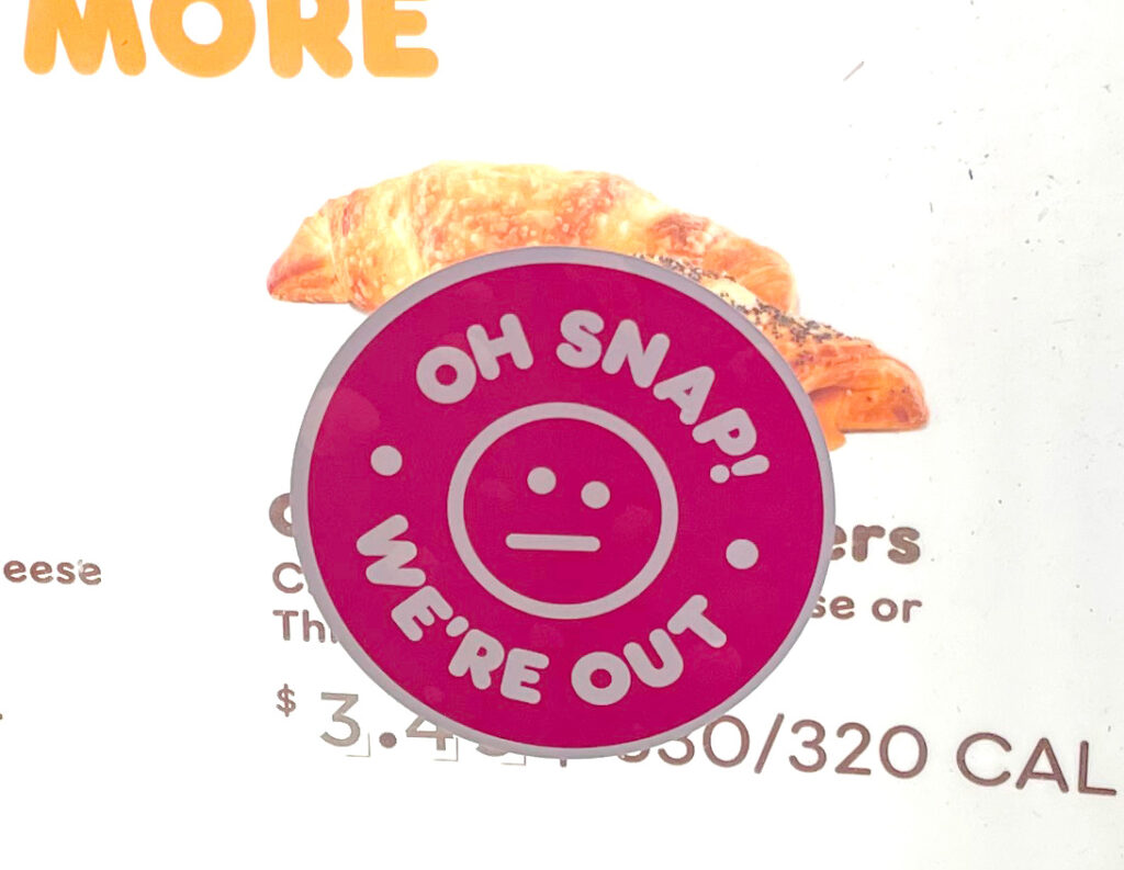
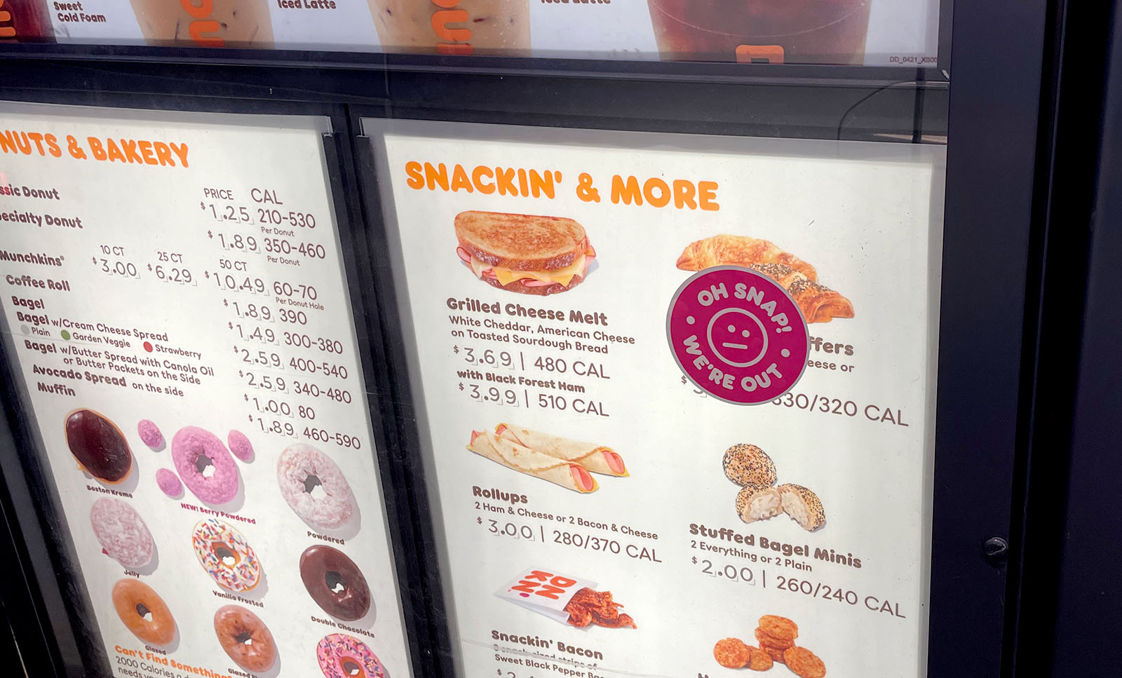
When Dunkin’ was out of an item, employees would stick one of these stickers on the drive-through menu board.

Dunkin’ could have written “we’re out” in marker on a piece of paper and taped it to the menu board. These kinds of signs feel like a hack. They’re unprofessional and smack of a lack of forethought. They feel like the organization is not thinking ahead.
They could have skipped the sticker—having employees tell customers, “oh, sorry, we’re out of that” when customers asked for an item that was not available. This approach produces disappointment. When you’re sitting in your car, dreaming of ordering an item, you’ve craved all morning, and then an employee tells you they don’t have it, it’s defeating. A sign stuck on the menu board lets customers think of an alternate item before verbally ordering.
Spot-On Messaging
Dunkin’s menu stickers showed they were thinking ahead. They knew they might run out of items from time to time, and they knew it was important to tell customers which items were unavailable before they ordered. So Dunkin’ made stickers that could be easily applied to the outdoor menu boards when needed.
And Dunkin’ did it in a very Dunkin’ way.

“Oh snap! We’re out.” Brilliant! The reticent smiley face emotes embarrassed frustration. It informs customers that Dunkin’ is out of the item, but in a fun and playful way like Dunkin’.

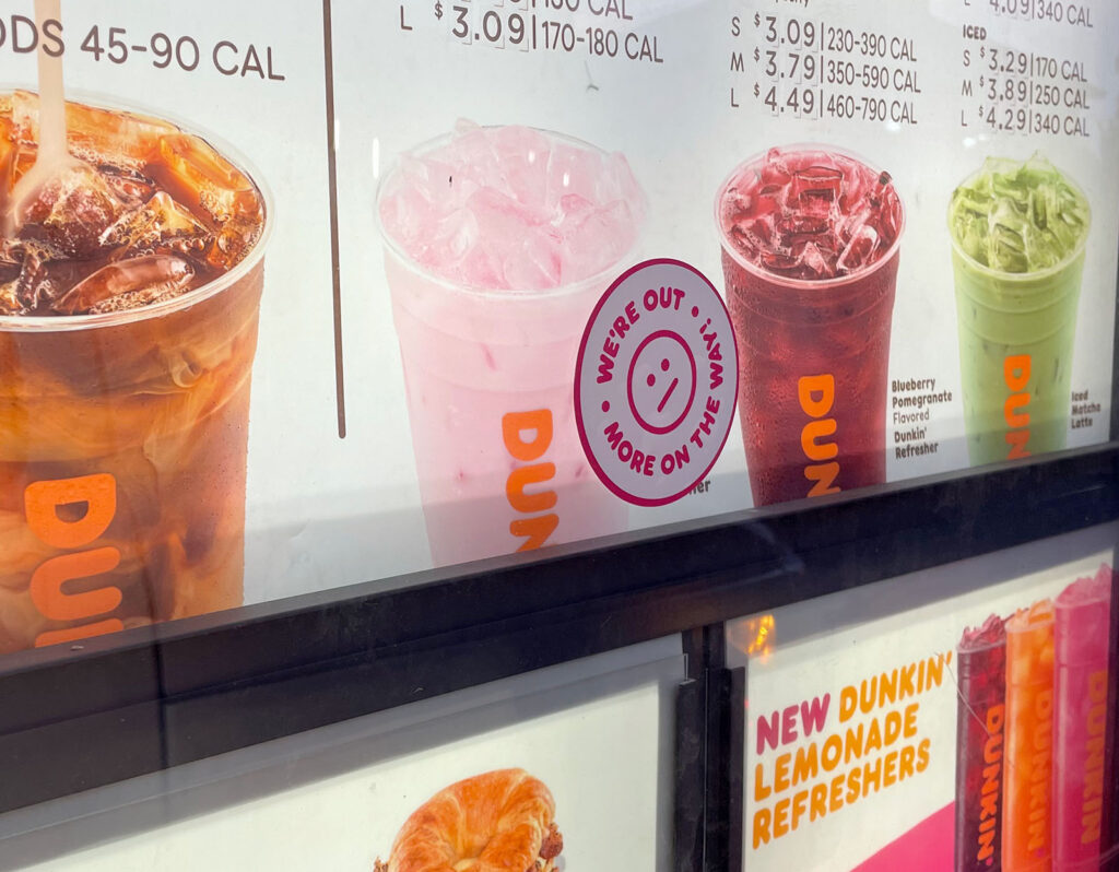
Dunkin’ has several types of stickers they use on their menu boards to tell customers they’re out. This variation keeps the board visually exciting and ensures that customers will read what each says.
Adapt Gracefully
When designing a service, there will be times when it will break. Something will always go wrong. How can you create stickers, signage, pop-up windows, or other messaging to help people cope with these breakdowns? Learn this lesson from Dunkin’: when things fail, you can recover with grace as long as you plan for these breakdowns.