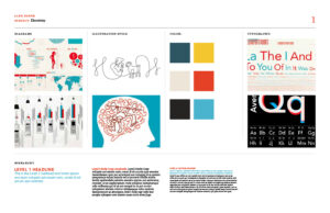
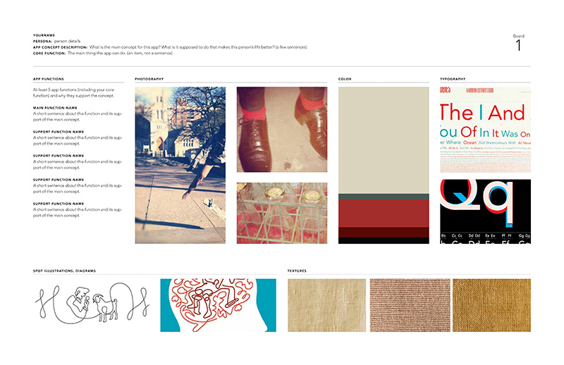
Style boards allow designers to group images, typography, and other aspects of designs into a cohesive presentation that captures a “look” or “feel.” These collections of images are sometimes called “job boards” or “mood boards,” but they all serve the same function: make the feeling or ethos of a design more real.
Style boards are an important design tool for both designers and clients/stakeholders.
Imagine… you are designing a luxury hotel concept and have been tasked to create a dining experience that will wow guests. Part of the project involves a logo/identity design, defining table linens, and designing the menu. When you meet with the client to present your design ideas, you talk them through them. “I’m thinking we’ll use a burlap texture for napkin holders combined with gold leaf emblems placed on the rings. The logo will use a straightforward serif typeface that shows sophistication, but still has a modern serif design…”
Wouldn’t it be better if you just showed your client what the overall feel of the design could be? That’s where the style board comes in. The style board below captures textures, images, and typography to present a vintage feel. Based on this board, we have a good idea of what the look and feel of the design will be.
Style Board Examples
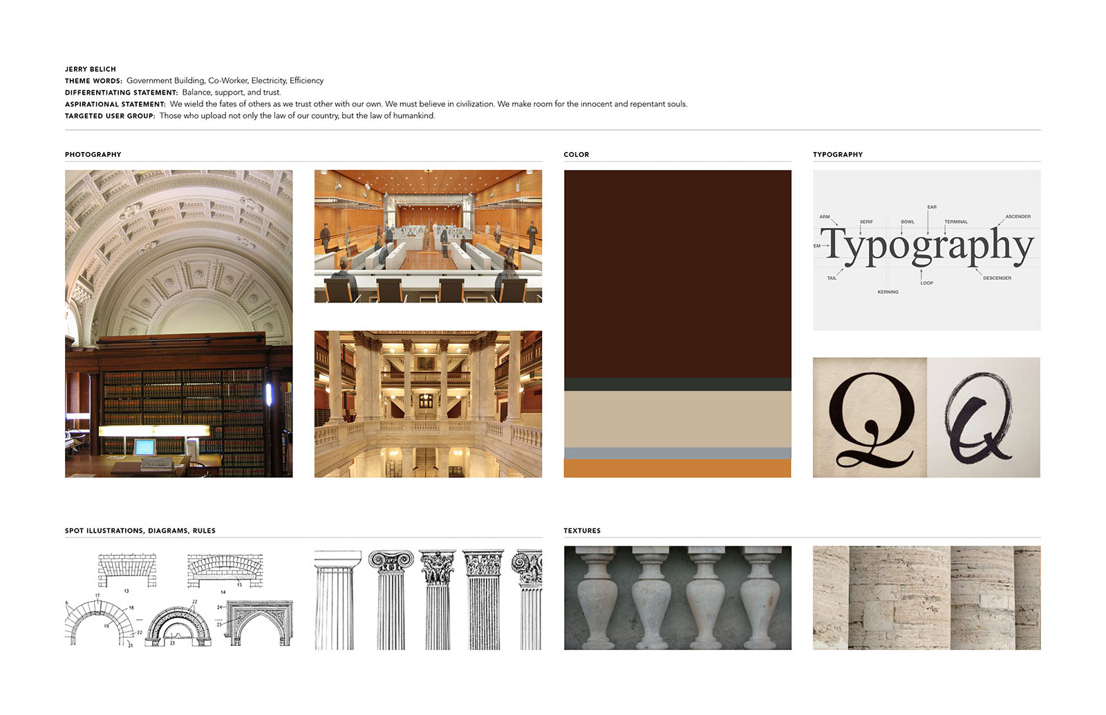
This style board (produced by Jerry Belich) captures the formality of a courtroom. Typography feels formal, colors mimic wood paneling, and stone columns communicate the stately nature of the environment. It’s clear that the proposed design will feel fairly classic and traditional.

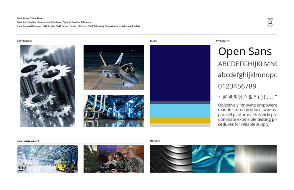
This style board produced by Mark Cela brings together blues and steely colors that feel like metal and speed. The sans serif typeface is modern and sleek. Textures are machined. All of the elements of this style board work together to present a unified feeling.
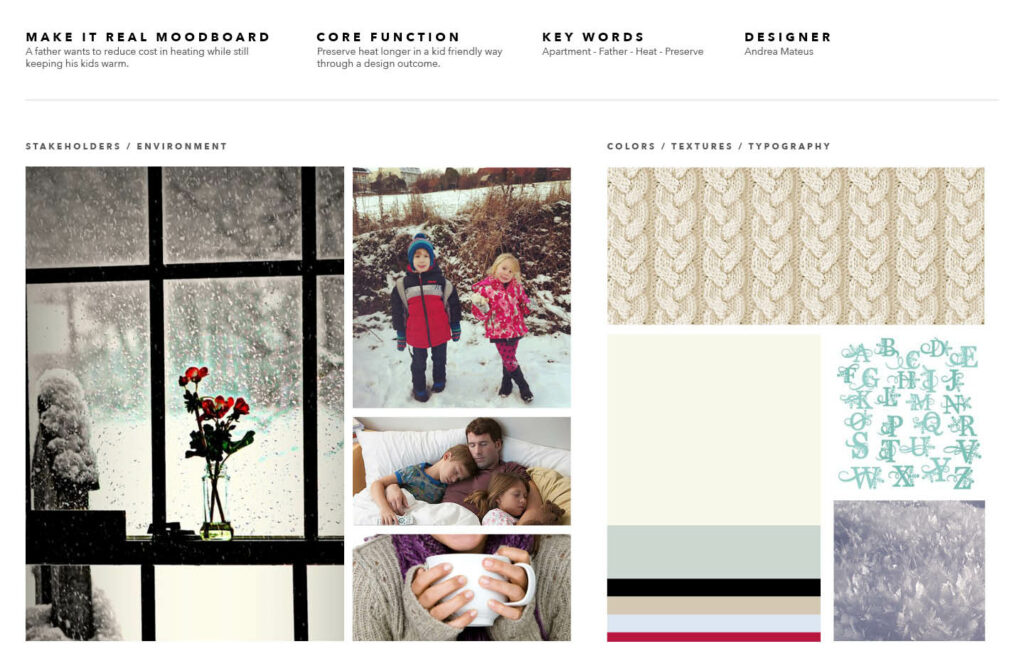
This style board by Andrea Mateus Forero is homey and calming. While it presents a winter scene, it does not focus on coldness, rather it presents the cozy feeling of escaping the cold. The sweater texture is organic and heavy. Photograph treatments feel like moments in a family’s winter weekend.
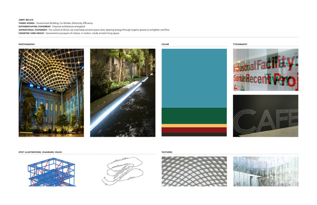
Museums come in all shapes and sizes, but this style board for museums by Jerry Belich presents a vision of a modern, minimalist museum. Light, color, and pattern suggest a contemporary feeling. When style boards work well, they communicate the nuances of a design’s communication and materials. Not just a museum… this specific kind of museum.
Below is a short tutorial on creating a style board in InDesign.
Resources
Pinterest can be a great way to create style boards/mood boards. There’s even a Pinterest board for mood boards. (how meta is that?!).
Go Big
To create your style board, use the files inside Style Boards Templates (ZIP File).
Style boards can be developed by using any type of software, but InDesign or page layout software works best. Follow these steps when creating a style board:
- Decide on a feeling you’d like to convey
- Search the web or shoot your own imagery, colors, textures, typefaces
- Compile these images into the style board
As you develop more style boards, you’ll improve your skills at seeing and connecting imagery in cohesive ways.