Colors communicate meaning. When you pull up to a traffic light, you know that red means stop and green means go. We won’t dig into semiotics here, but this concept of color serving as a sign for something else is central in Communication Design. Let’s take a moment to learn about color.
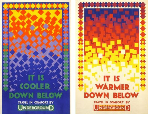
Color can communicate meaning even without images. The posters below communicate warmth and coolness using only shape and color.
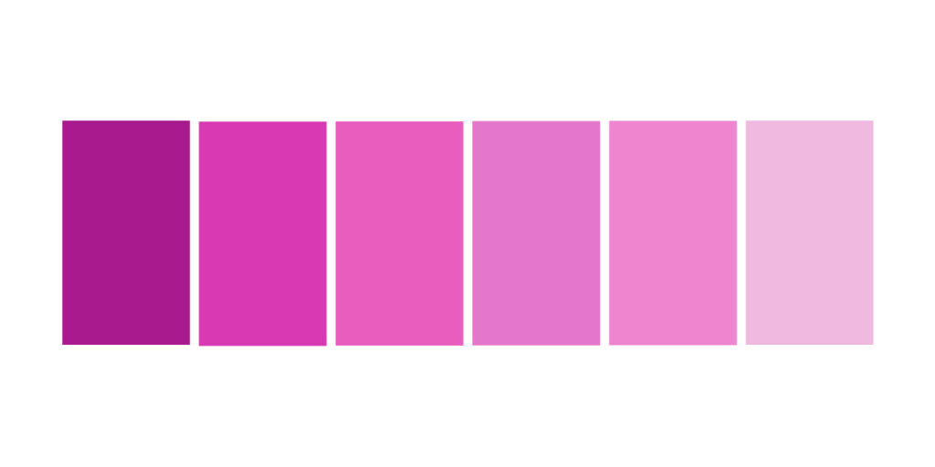
Color can also be used to represent measures and intensity. Look at the example below. The left-most rectangle is most intense in color while the right-most rectangle is the palest. If we used these colors in an infographic, readers would conclude that the darkest colors depict the “most” of something and the lightest depicts the “least” of whatever is being communicated.
When you use color to communicate, be aware of its cultural content. Some colors mean different things to different people. These cultural meanings can be your friends or they can upend the message you wish to communicate. Select the right colors for the message!
Selecting Color Palettes
Color seems easier than it is. If you have ever had to put together a color palette, you probably know the challenge of creating a palette from nothing. The more you plan color, the better get at it, but building a sensibility for color takes time. There are many color palette tools out there, here are a few of our favorites.